Attention is key, even when you're designing new product packaging. So how well do prize-winning designs fare when put under the scrutiny of Neurons AI? Here, we show recent designs and how they fare on attention.
Packaging is an extremely important touchpoint for brands. If the design is off, customers that look for your product can have a hard time finding it. If they are browsing the shelf, they might miss the product altogether.
A lot of the talk we have on attention seems to be concerning advertising. But attention is just as important when you are in the store -- whether it's e-commerce or in brick and mortar stores. In most CPG industries, such as the beer industry, it's called a "shelf battle."

The battle for the beer shelf is on! With so many products, who's winning the attention war? In this picture analysis, we can see that certain elements are winning more attention than others. But with a Cognitive Demand level close to 50%, customers are very likely to feel overwhelmed and cognitively stressed. In sum, the fierce competition can reduce customer engagement, in which every brand loses a bit.
Let's break this type of in-store attention into three main types of steps:
- Passive browsing -- does your package "pop out" when customers are passively browsing a shop aisle or online store? This type of attention is direct, unconscious, and packages with salient features are more likely to succeed in grabbing attention.
- Active searching -- when customers are actively looking for particular products or brands, they are engaging in a search strategy. This is associated with a focused, conscious form of attention, and it's important that your package matches the expected features.
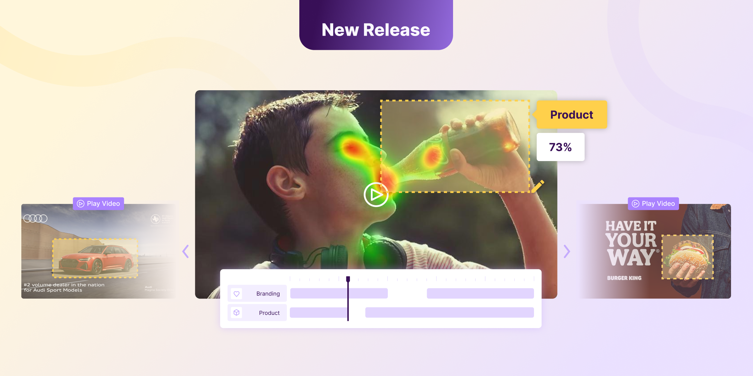
- Product facing attention -- when customers have selected your product and holding it up close, what are they most likely to notice?
In this post, we will focus on the third type of attention. And here, let's focus on one type of packaging where there is a known attention battle: the beer industry. A trip to any well-assorted store at most places around the world is likely to give you an abundance of options, with different brands stacked in the same area of the store. There's a possibility of visual overload, and you'll be challenged to find exactly what you're looking for right away.
So for this post, let's see how different new bottle designs fare on a few selected criteria. From a customer perspective, there are a few things that are important, including:
- Brewery brand
- Taste/type
So let's keep it simple. Your customer has now picked your product from the shelf and is inspecting it. What will they see? Will they see your brand, and will they figure out what kind of taste this particular product has? Let's first take a look at each of the contestants:


Then, how did each of the products fare? Here's what we did: we first drew Areas of Interest (AOIs) around the brand and the taste information for every bottle in each of the images. For each image, since we were looking at the same brand, we aggregated the score for all brand AOIs and taste AOIs separately. We also included data on the aggregate Cognitive Demand and Clarity scores.
Here are the results for each of the image analyses and the overlying AOI analyses:


To get an overview of this, we also show the results as a plot below across all beer brands:

From this, the first thing we need to realize is that across all these new and shiny designs, we have very low attention to both the brand and especially the taste/product information. This suggests that customers may have a hard time looking through the otherwise nice designs to understand what the actual brand is. However, here, the actual product design can often serve as a whole point of branding in itself. For example, the Bandidos product design is unmistakable.
However, when it comes to taste attention, every single one of the products fail. Why? Because they get attention to the taste that is less than or around 1%. This is simply not enough, as customers need to go through the entire package to find out what taste it is. Imagine having to do this for every single product you're buying in the store...a waste of time for everyone.
How about Cognitive Demand? This is a score that speaks to the amount of information that the customer needs to process. Let's see how the different brands fare on this score:

Ballast Point by far is the top scorer on Cognitive Demand. This score is also too high for customers to be able to sift through the information. The winner is Wicklow Weiss, which produces a neat low CD score, and here, customers are more likely to understand the main information provided on the product.
The Cognitive Demand score is also highly related to the cognitive load theory, especially the so-called extraneous cognitive load, which is related to the way in which information is provided to people and how this loads their cognitive workload. Too high a load is related to confusion and lower comprehension, and ultimately resignation and avoidance.
The solution? Prioritize your design. It should be shiny and fancy and cool, but not at the cost of the main use it should have for the buyer: they need to find out what it contains, and if they want a lager beer, you bet they won't be happy with a pale ale...
Product design is a great opportunity to win customers, but with the wrong design, you're also running the risk of losing their interest.
Test your product designs with Neurons. Contact us for a free demo.