The client: Monotype
Monotype is the world’s biggest type foundry that developed many of the most widely used typeface designs, including Times New Roman, Arial, and Gill Sans.
Besides designing and engineering iconic typefaces for world-known brands like Renault, Zacapa Rum, Duolingo, and Premier League, Monotype also offers a suite of brand services for global clients to express their voices through type.

The challenge: Measuring the branding impact of typefaces
Monotype along with many other design and brand experts has known for years that type affects how people feel even if they can’t explain or prove exactly why. Consumers can instinctively sense when a typeface isn’t hitting the mark or that it is.
These responses are typically unconscious, making them hard to measure with traditional means. This is where applied neuroscience can help reveal the real emotional impact of design such as typefaces and the way they elevate brand narratives and experiences.
Monotype partnered up with Neurons to put its creatives’ deepest-held beliefs to the test, and to be the first to measure how fonts drive experiences, associations, and feelings. With the data, Monotype’s goal was to help prove the branding value of type and to start to equate outcomes to creative decisions.
“During the pandemic, everybody went onto their phones and rectangular devices, just to realize that many companies and brands use the same typefaces, system defaults, and the same geometrics,” shared Phil Garnham, Executive Creative Director at Monotype.
“It was the moment when brands actually realized that they needed to step away from the standard and start differentiating with the use of more expressive and more ownable typefaces. Distinctive typography is becoming more important than ever for digital brands.”

Remote testing for real consumer responses
The team at Monotype carefully selected type parameters along with screening questions to set the direction for the study. Then, after a swift review process by Neurons’ expert team, the survey was launched to collect statistically significant data within just a few days.
Monotype and Neurons surveyed 400 participants in the UK aged 18 to 50, using three types of stimuli: single words, sentences using those words, and sentences shown with a brand. The words and messages conveyed values that are common in brand mission statements such as trust, quality, and innovation.
Each word and statement was designed with three different typefaces – FS Jack, a humanist sans; Gilroy, a modernist geometric sans; and Cotford, a languid serif.

Though these typefaces may appear familiar to consumers, they were not used in connection with any specific companies in order to prevent any pre-existing associations. “Selecting appropriate typefaces was of paramount importance in ensuring conclusive data,” explained Phil.
Participants from Monotype’s target segment then responded to the survey and rated the pairings as part of an implicit association test. Respondents rated the font-text combinations based on how they made them feel, including how genuine, memorable, trustworthy, or confident they felt. The tests were run on the participant’s own mobile phone.

“The focus of this study and its angle was taken from real-life branding touchpoints and measured real people's emotions when looking at type on their phones,” shared Marie Boulanger, type expert and Monotype’s brand designer, who led the brand campaign revolving around the Neurons study.
“It was very much a conscious decision to use the mobile phone format since this is how most people consume type and see fonts today. The test was really trying to be as close to what people's experience of typography is as possible.”

High impact on the brand & the world of typography
The study showed that people have strong emotional relationships with type and our brains have a significant response to typefaces. The study found that type choice can make a word appear 13% more relevant, sparkle a 10% increase in how memorable it is, and bring a 9% increase in trustworthiness.
“It’s invaluable to have research supporting what we type designers have known all along: type gives brands the emotional edge.”
- Phil Garnham, Executive Creative Director
“Typographic features, the granular details found within letter shapes and overarching tonal themes in fonts, connote real meaning and appropriateness and have the power to directly influence emotions,” reflected Phil on the study results.
“We typically expect similar studies to reach results between 0% and 5%. The fact that responses reached 13% in this study, confirms the power of type and proves it truly impacts people’s emotions,” commented Mike Storm, COO of Neurons.
“I genuinely felt the excitement, the passion from the Neurons team, the excitement about being part of something new, that nobody had done before.”
- Marie Boulanger, Brand Designer
The Neurons study served as the backbone of Monotype’s brand campaign titled Why fonts make us feel. The campaign’s primary focus was on open discussions and social-first content. “It was a strong, defining moment for our brand. We haven't seen anybody do a study at this scale with a broad audience sharing it openly and freely as well. Webinars, talks, social content around it, with no paywall, no gates,” shared Marie
The campaign’s main goal was to evoke participation and to spark conversions within the brand’s ecosystem, with its communities, and beyond. Monotype strived to have a dialogue with their audience rather than just serving up the findings. “We got more engagement and dialogue through this particular campaign than any other project we had before it,” concluded James Fooks-Bale, Senior Director of the Monotype Brand..
“As creatives, we all care about typography. But this study switched everyone else on - everyone on the other side; the person you often have to convince, who holds the budget, or anyone outside of the creative industry. This is something they found tangible and proving. It doesn't happen very often to be able to talk to both sides of your audience.
- James Fooks-Bale, Senior Director, Brand
Top performing brand activation campaign
The findings were first presented in a webinar dedicated to the study, followed by a free eBook. Monotype promoted the event and the book primarily through inclusive social media content, including polls, videos & animations.

Monotype saw increased social activity on all of their platforms for posts relating to the campaign, with users creating organic content around the topic, referring to the study both online and offline.
Key results of the campaign include:
- 200% increase in Instagram poll engagement
- +51% in 30-day LinkedIn engagement
- 2140 webinar registrants and 600 live attendees
- Press in PRINT magazine, It's Nice That, Fast Company, typeroom.eu
- Study mentioned by industry legend Abbott Miller of Pentagram NYC at Typographics NYC
“This is how far it's traveled and how effective it's been. It's reached the level of truly being used as an industry reference.
- Marie Boulanger, Brand Designer
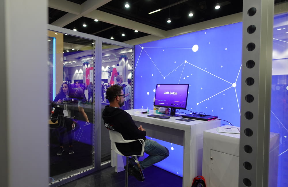
Monotype also brought the campaign to Adobe’s major annual creativity conference, Adobe MAX, where Monotype saw a record number of registrations for their session. For their booth, the team set up a Type Lab, an immersive experience where attendees could see their reactions to their names written in different typefaces.
During the 2.5 days of the conference, Monotype also surveyed 400+ people, collected around 2000+ leads, and held a session with ca. 550 attendees.
The study is also the central theme of the 2022 season of Brand Talks, a Monotype event series that brings together design, marketing, and branding professionals around the world.

Neurons Explore delivers key results & boosts the Monotype brand
The campaign’s success showcases the potential of Explore tests, helping brands like Monotype elevate their narratives and experiences through neuroscience-based panel tests.
If you're looking to take your brand to the next level, test your ads for unconscious motivation or contribute with unique insights to your audience, book a demo today with a Neuromarketing Expert!


.svg)


.svg)