While e-commerce is on the rise across the globe, the industry has come to realize that we need good design principles from this new "store" experience. As the customer journey is very different between online stores and brick-and-mortar stores, we show how you can start by boosting the buy button.
The surge of e-commerce
We are getting more used to purchasing goods online. Especially after the COVID-19 virus pandemic, online sales have been surging over 30% in the US alone. Indeed, estimates show that e-commerce businesses should anticipate a 265% growth rate, from $1.3 trillion in 2014 to $4.9 trillion in 2021!
Still, there are many challenges ahead in ensuring that online shoppers actually make their choices. Our understanding of online shoppers is still in its infancy, but it is clear that our models from in-store purchasing do not apply directly to e-commerce.
Product liked, purchase not happening
As many e-commerce owners know, shoppers are spending a long time browsing their pages and products, but very often don't put an item in the basket. Sometimes this is because it's not the right product or the right price, or some other reason.
What we have seen is that often, the online store misses a crucial opportunity: the purchasing trigger! When looking, you can see that the buy button is there, so why are so few using it? Here, a bit of visual attention magic is needed.
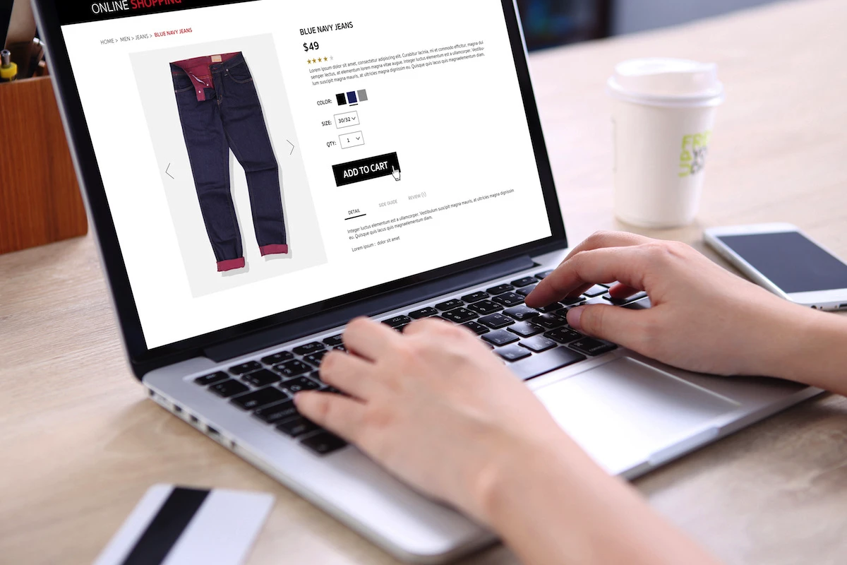
When the buy button fails
Below you can see a website that shows the typical pattern where visitors inspect the product for a long time but never put it in the basket.
A quick analysis shows us what's wrong:

As you can see, the buy/basket button is not standing out in the analysis. From this, it's clear that it will not get automatic attention, and visitors need to actively look for it. This is a failed trigger: a button that is very visible will also trigger an action.
Boosting the buy button with visual saliency
To add visual saliency to an element, a few tricks can be used:
- Increase the contrast and sharp angles, but with consideration to overall look and feel.
- Try out different color combinations.
- Make the background a single color and/or blurred out.
- Reduce the number of competing elements.
- Rearrange and distance the important element from other things.
After trying many different iterations, you can end with a result like what you see below:

Complexity is key
When considering adding focus to certain elements, it's important to also consider the background. As in the examples shown here, the main website has a very simple background and overall design with few visual elements. When using this type of interface, the changes one makes will typically have a very strong and noticeable effect.
Things often look different if you have a busy with a more busy background, and with many visual elements. Here, changes are more likely to make more subtle differences in visual attention. To make single elements stand out more, there are mainly two maneuvers you can make:
- Increase visual saliency of the element itself
- Decrease the complexity of the surroundings
Both these changes have more dramatic effects on attention towards the desired element. But they come with potential drawbacks. If you boost visual saliency to an element such as a product or a checkout button, it will typically look more dominating and even misplaced on the page. Conversely, if you reduce the overall complexity of the website, the overall look and feel of the website might be different from what you want.
Typically, a combination of both should be considered, such as both reducing context complexity and increasing element saliency.
But there's another trick that is possible: make a bit of space for your element and frame it in.
Below, you can see how Amazon does it: they are framing the action buttons with a light gray line. The gray is faint, but effective enough to make this space stand out and get more attention.

Optimize attention to the buttons on your website with Neurons AI analysis tool! Book a demo today to see how it works.