Signage design boosts attention
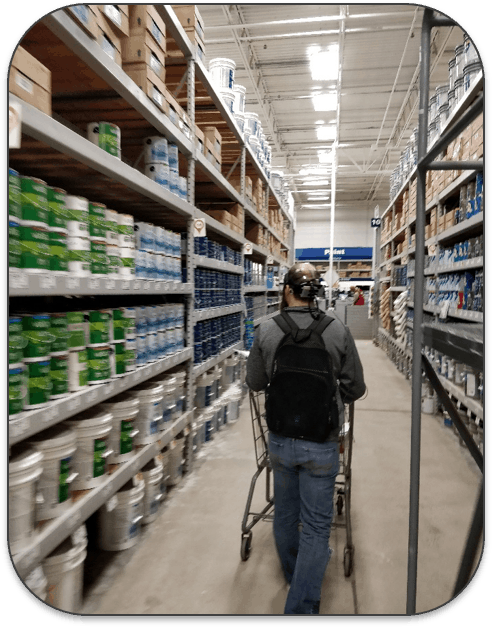
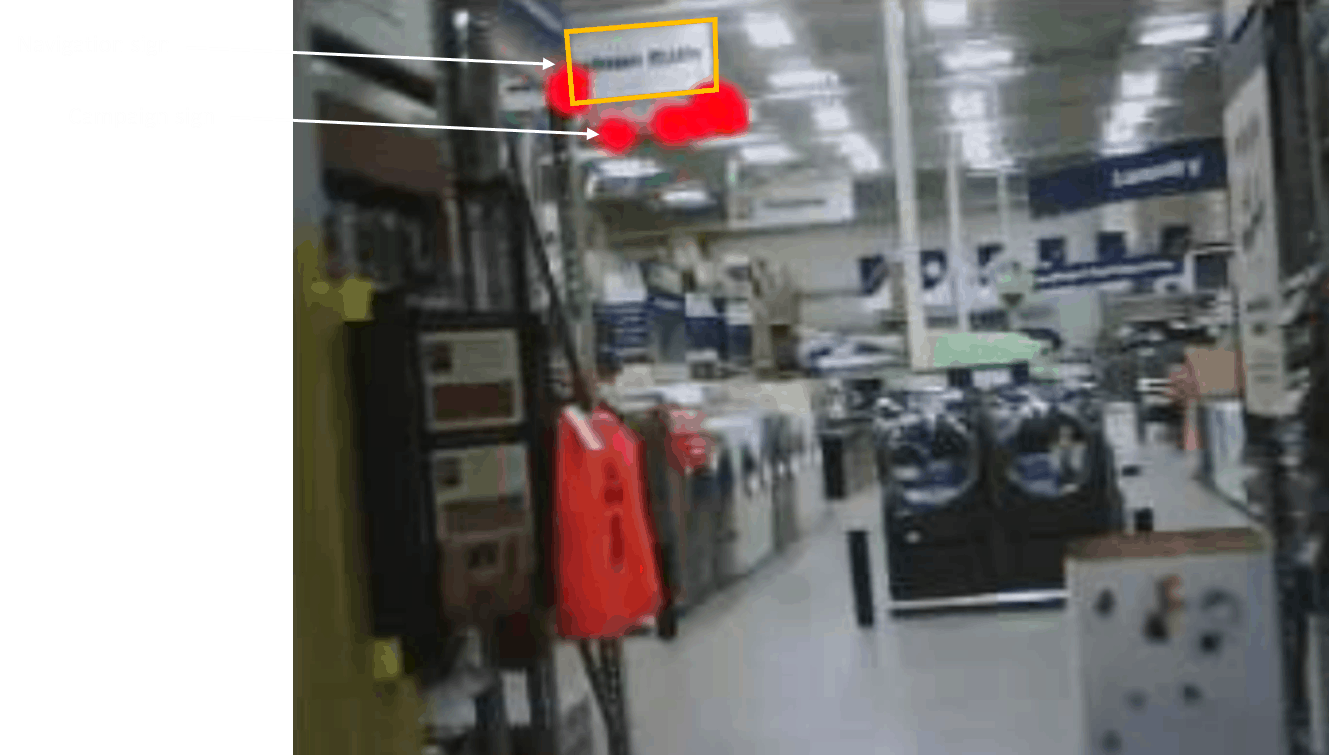
As part of the study, we used mobile eye-tracking. That is, we used eye-tracking glasses to capture visual attention while the participants were walking around the stores. What we discovered was that when people looked towards the ceiling signs that would otherwise help them find the way, they were distracted by a campaign sign that was hanging just underneath it! Instead of looking at the navigation sign, the campaign sign got all the attention.
Importantly, the campaign sign was about the company's new website, which bore little relevance to navigation needs. This is shown by the red dots of the eye-tracking in one of the participants in the study. As you can see, the eyes are mostly fixated on what's underneath the main white navigation sign, and mostly not on the navigation sign itself.
When we use eye-tracking, we can quantify visual attention -- for example, as how many people see (or miss) a given sign, and for how long they are looking at it. By doing this, it is possible to compare different sign designs to identify what works best. In doing this, we tested customer visual responses to new ad design, where the design was optimized for boosting visual salience.
Here, we found that the new sign was successful at getting attention both when people were browsing the store (e.g., passive attention to signs), and when they were actively navigating the store. Even more compellingly, we saw that the time that people spent finding the right aisle was 40% faster with the new design. This suggests that navigation signs that are optimized for gaining automatic attention indeed show more attention and boosted navigation success.

Visual salience is key
Visual attention is more than a single thing. We know that our eyes can be drawn to things for several reasons. For example, if we are looking for a Coca-Cola product, we will be more likely to see products that are red and with curly letters. Another type of visual attention is emotionally driven, as when we are more likely to notice something that is either threatening or appealing. But one type of attention that we often forget is visual salience -- an automatic response to properties in the visual object itself relative to its surroundings, which makes it "pop out" to our eyes, and our eyes are automatically drawn to it. Using eye-tracking alone, we don't know if people are looking at something because they are looking for it, are responding emotionally to it, or because it automatically pops out. To better understand and measure visual salience, we are using NeuroVision (renamed to Neurons in 2024) which is a mathematical algorithm that predicts what people are likely to automatically notice. When you upload an image or a video, it processes the image(s) and produces a heat map which shows the most visually salient features in the picture or video frame. It now has an 85% (increased to over 95% in 2021) accuracy compared to eye-tracking tests. By analyzing visual salience for in-store signs with NeuroVision, we could see that the signs (orange squares below) simply did not gain automatic attention. Rather, many other things were more likely to grab attention.
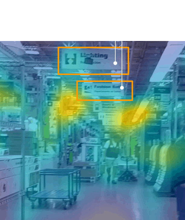
By then using this information to work on different sign designs, we helped the sign design team to find the most suitable sign to boost visual attention. We first worked in Photoshop and then used mocks in the store. The final product was then tested with eye-tracking tests to ensure that the final design indeed was seen more than the traditional sign.
Going beyond signs
Understanding in-store sign responses is only one way that consumer neuroscience can help retailers and other companies improve the customer journey. As a side note, we have seen that optimized signs also produce a lower cognitive load (customers do not need to actively keep in mind what they are looking for) and more positive emotional responses (better navigation improves flow in the customer journey to focus more on product responses).
Going beyond navigation signs, the same approach can be used to improve price labels such as shelf-edge labels. Here, one could ask whether it is more important to have customers focus on the product or the price first. Also, shelf planning itself can be helped by understanding the visual scan pattern that customers show in the store. By using this, often in conjunction with emotional and cognitive responses, it is possible to find ways to substantially improve the customer journey.
You can try out Neurons yourself, or book a demo with us to delve deeper into how it can help you optimize the user experience in-store, just like Lowe's optimized and improved theirs with the help of Neurons' older models.


.svg)


.svg)