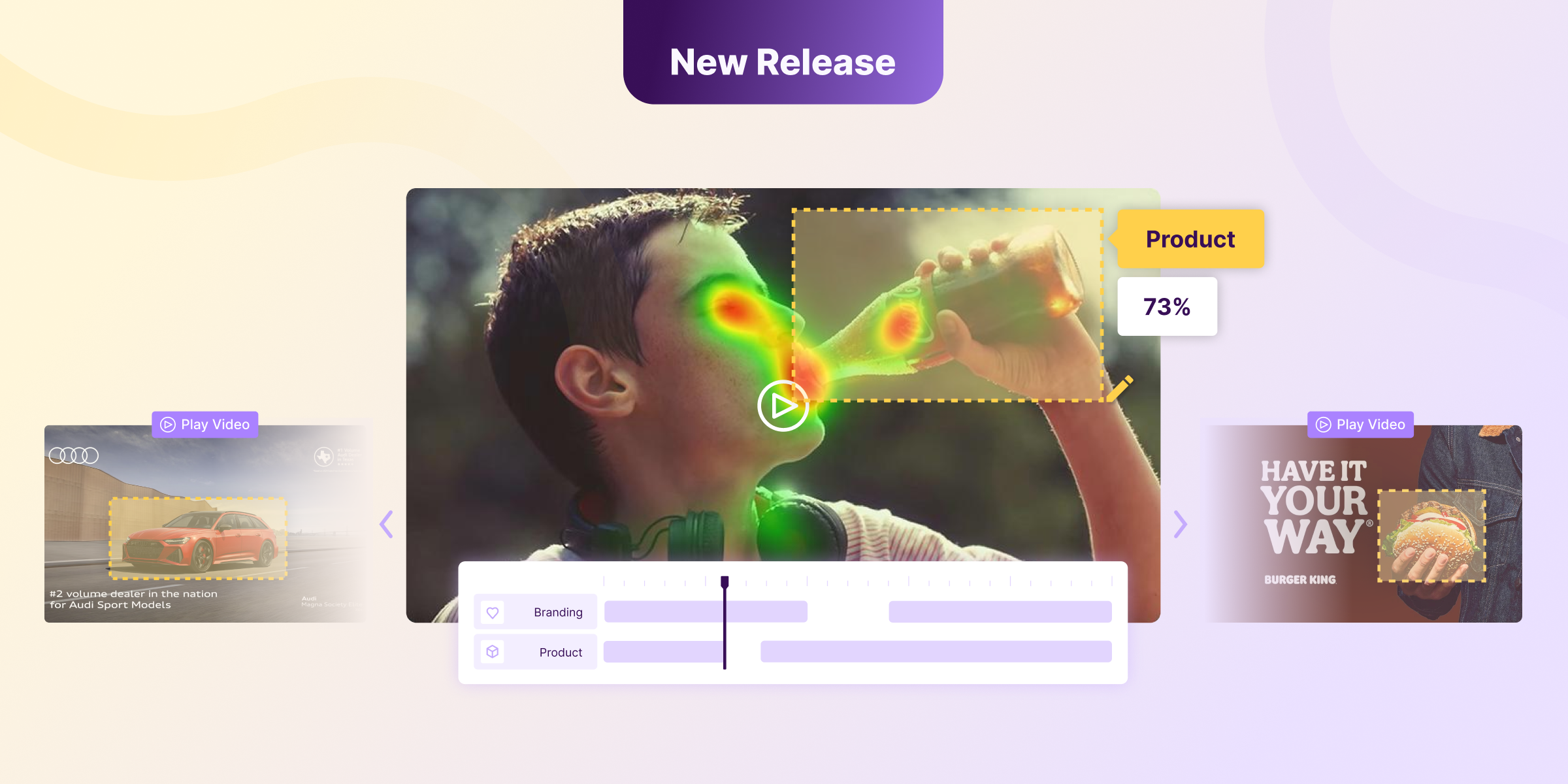
What makes you choose one Netflix content over another? Content with more attention-grabbing power will naturally capture more viewers. Chances are, there are subconscious processes guiding your decisions.
If you are a subscriber to any on-demand TV content nowadays, you have probably been countless times trying to choose what to watch and haven’t been able to make a decision (at least for a while). What makes you pick what you want to watch? While you are innocently browsing through the content options, your brain is guiding your eyes and processing all that information, helping you make the right choice. There is a process that is particularly relevant here: Bottom-up attention.
Bottom-up attention is a term used in neuroscience to describe attention that is guided by external factors. It is driven by stimuli that are salient simply because of their visual properties, like color or contrast with the background, for example.
Do not confuse this with our scan patterns. A scan pattern is how your eyes scan a page when you are presented with it. This usually goes from top to bottom and from left to right in westerners. Bottom-up attention has nothing to do with this. In contrast, it refers to the neural pathways involved in the process. These usually start with lower-order visual processing (eyes, retina, visual nerve), and move upwards to higher cortical areas (visual cortex).
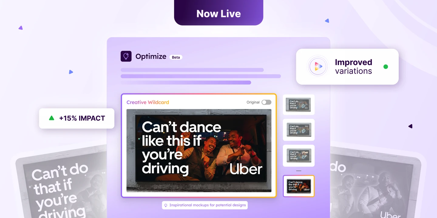
With these neural processes at play, the more attention-grabbing content gets an advantage. It is almost like a built-in filter in your brain that chooses only from the most salient content. This is what sparked my idea: if I can predict what is the most salient content, then I can predict what is going to be chosen more often. By using Neurons' attention predicting algorithm, I could easily identify which content is passing the attention filters of our brains, and will therefore be more popular.
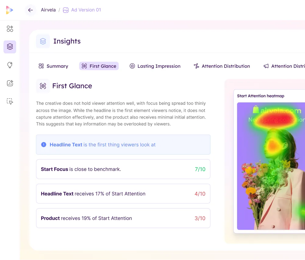
I was astonished by the results. Using Neurons' heatmap functionality allowed me to understand what content gets filtered in and what content filters out. Crucially, it helped me respond to two questions:
What?: Identify what content passes through the bottom-up attention filters, and is likely to be more viewed by users.
Why?: Identify which aspects of the Netflix thumbnails make them more salient as stimuli. This helps understand the reasons behind salient content and allows to maximize the attention towards the thumbnail.
Let’s go through some examples.
Films: We scan the page from top to bottom and left to right
Let’s start with the films page. The typical Netflix layout includes a series of horizontal reels -or carousels-, each of them representing one subcategory. In this case, I scrolled to show three subcategories on the page: Critically-acclaimed Films, Trending Now, and Documentaries.
Netflix usually shows a single film at the top of the page, which covers the entire screen and usually includes a video preview. This is irrelevant for our exercise so I have decided to scroll through it.
In the image below, you can clearly see what content stands out the most. This content is likely to pass the bottom-up attention filters more effectively, and will probably be seen first, and by most users.


What?
There are about 18 thumbnails on the screen, there are 7 most salient thumbnails, which are:
- The social dilemma
- Rocketman
- Three identical strangers
- Joker
- Night Gate
- My octopus teacher
- Kiss the ground
It is also worth mentioning that the surrounding thumbnails will also get a certain level of attention. Just like the heatmap represents, there is a certain “halo” around the most salient content.
Why?
Visual scan patterns go from top to bottom and usually left to right on westerners. Due to this, the top-left corner has chances to be seen first. That makes The social dilemma be among the attention winners. Also because the “Films” category title is likely to grab some of the attention, and halo that over to the Social dilemma thumbnail.
White thick font on a darker background make the Joker title stand out. The Joker and Kiss the ground titles use the thickest fonts on the page. This calls the bottom-up attention due to the high contrast with the background.
Romantic films: Facial expressions attract attention


What?
Grease, The 40 year old virgin, and Holidate are what you see first from the Romantic Films category.
Why?
A coincidental high-contrast cluster makes Grease and Virgin be salient titles. These two titles happened to be next to each other by chance. One has white background and darker letters, the other has a darker background and white letters. Together, this forms a cluster with highly salient angles, even the line that divides both thumbnails is helping here. The combination makes this the most attention grabbing area on the screen.
Humans’ attention is innately driven towards other humans’ faces. Holidate uses this trick by displaying two faces next to each other, with a Christmas tree in the background and a shiny font. It is worth noting that in the Romance category, many of the thumbnails portray faces. For example, Twilight and Love guaranteed also stand out with highly contrasted human faces in them.
Sci-Fi films: White on black wins


What?
Out of the 18 content thumbnails displayed, 6 of them grab the most attention:
- Edge of tomorrow
- The hunger games
- Matrix Revolutions
- Annihilation
- Black Mirror Bandersnatch
- Men in Black II
Why?
By now you should already be familiar with the old trick of light, thick font over a dark background. This is what makes Black Mirror, Men in Black II, and Edge of tomorrow stand out from the rest. For Men in Black II, they even smartly overlaid the entire logo on the black suit of the actor, maximizing the contrast and making it a highly salient movie title.
Why are G.O.R.A and Inception not so attention grabbing when they also seem to have a salient title? That first, because the thumbnails are all the way on the right. See how the entire area on the right just receives the lowest levels of visual attention. Another reason is because of the competition for attention. Even when these two stimuli are salient by themselves, there are other stimuli on the screen that are more salient. Attention economy is a limited resource, and there is only enough of it for the winners. It doesn’t leave room for the second on the podium.
Netflix originals: Mastering users’ attention
Sometimes you see a section with larger thumbnails, covering a taller part of the screen. These are usually selected content, top rated, or, like in this case, Netflix originals.
As a content producer, Netflix has proven a very successful business. They are experts in creating viral programmes that are viewed by millions of users. Part of their success lies on making the content that is attractive, and, as we have learned, visually salient.


What?
All the content is highly salient! Six out of six thumbnails have hot spots for attention. Netflix designers are masters at making Netflix originals the most attractive content.
Why?
The screen suddenly becomes darker, wth a few elements really standing out from the background. Notice the consistent use of white font on dark background. Notice the “X” in the middle of Love Death and Robots that is impossible to miss. Notice the use of faces and facial expressions to grab every bit of the viewers attention. With the mastery of these visual techniques, Netflix is making sure no user misses their self-produced content.
In a few minutes, the Neurons tool has helped me predict what is the most popular content on Netflix, and understand the aspects that make content thumbnails stand out more.
As a final note, I would like to say that attention is not all there is. There are emotional aspects and preferences that guide you to the content you want. For example, if you have a preference for bloody and gore content, these could be more salient to you. Sometimes Top-down attention comes at play. This is the opposite of bottom-up attention, where your higher order cognitive processes are guiding your eyes for what you consciously are seeking for. For example, when you are searching for a specific film, you will be directed to that, and will be less subject to the manipulation of the saliency and other bottom-up attention aspects.
There are also the recommendations from Netflix. Every users’ page is unique, with content that is adapted to use based on your use of the platform and the content you have chosen in the past. You can read more about this on How Netflix recommend system works.
Now is your turn, explore your content thumbnails with Neurons on Netflix and tell us what do you see, what you miss, how do you make your choices.